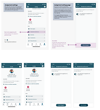
ASSIGNMENT MANAGEMENT
Designed and launched an assignment management experience that generated over $70,000 in revenue within the first month of release.
THE CHALLENGE
Healthcare professionals using the platform were missing out on shift opportunities because the assignment experience made it too difficult to find, evaluate, and act on relevant work quickly. The flow required too many steps, surfaced the wrong information at the wrong time, and created friction at exactly the moments that drove revenue. The objective was to redesign the experience end-to-end with both user efficiency and business outcomes as equal priorities.
ROLE & SCOPE
Served as the lead designer across the full project lifecycle, from research and problem framing through UX strategy, interaction design, prototype validation, and developer handoff. Worked directly with product leadership to frame requirements around revenue objectives and collaborated closely with engineering to align on scope and hit launch timelines.


RESEARCH & INSIGHTS
Research included analysis of existing user workflows and direct interviews with healthcare professionals to understand how they were navigating assignments day to day. The findings pointed to two consistent sources of friction:
-
Unclear assignment structure that made it difficult to identify which opportunities were worth pursuing
-
Unnecessary steps in the navigation flow that cost users time at every interaction, compounding across dozens of daily actions

STRATEGY & DECISIONS
To increase both efficiency and revenue impact, I:
• Reorganized the information hierarchy to surface high-value assignments first
• Introduced clear status states
• Designed streamlined interaction paths that reduced unnecessary steps
• Aligned task flows with monetization triggers to ensure revenue opportunities were visible and actionable
Every decision was evaluated against user efficiency and business growth.

OUTCOMES & IMPACT
The redesigned experience generated more than $70,000 in revenue within its first month of launch, making it one of the highest-impact design deliverables on the platform.
I maintained close collaboration with engineering from design through delivery and used Figma Dev Mode as the primary handoff tool in place of Zeplin, which elevated the standard for component documentation and annotation. Every interaction state, component variant, and edge case was clearly specified, giving developers what they needed to implement with minimal back and forth.
The result was a faster, cleaner build cycle and a shipped product that matched the intended design with high fidelity.


